Project Goals
I was tasked with helping rebrand a company that’s been in the business of merchant processing for several years. They provided a service to allow prospective merchants to sign up with them so they could process credit cards. The goal was to use their three founding principles and a color scheme they had chosen. Since there were three principles, I decided to play off of that and use a triangle with each side representing a single one. I also tried to make it more interesting by separating it into three separate pieces. At the time, the trend was to play with 3D shapes so we went that route, where I added a subtle line to show a curve and make it more unique.
My Process

01
I gather information from the client regarding what their company does. I inquire if they have already decided on a specific typeface and a color scheme which I can reference. If not, I will go ahead and help them decide on one by offering samples. I draft up simple designs using the information as a starting point, which usually are doodles.

02
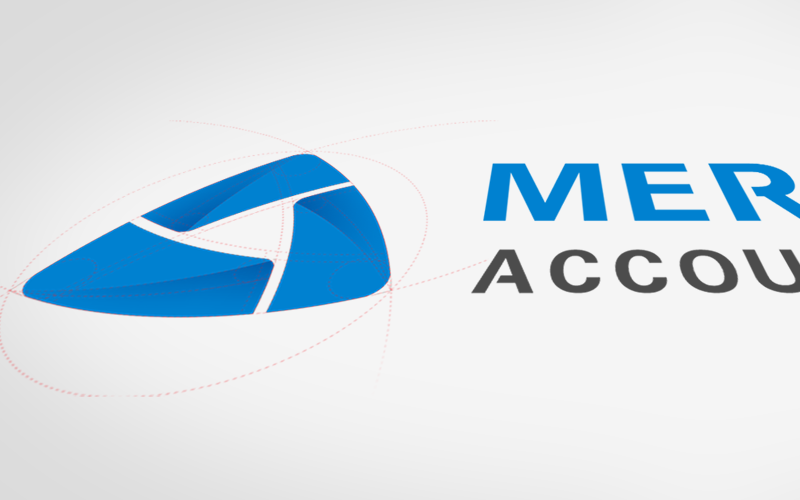
After my initial drafts have been mocked up, I begin to refine what I have using Adobe software such as Illustrator. I use shapes as guides to help form the icon and add the requested typeface for the text.

03
I submit the drafts along the way and wait for approval and requested changes. Often times, there will be a couple of back and forth communication until the final version is complete and the client is happy with how it looks. Once approved, I prepare the file and send it off to them. Using a vector based software, the logo is both web and print friendly.
Project Details
Font Family
Roboto
AaBb
Color Swatches
#005fad
#0081d0
#4c4c4c
#ffffff
Software Used

Adobe Illustrator

Adobe Photoshop


